Crave, a brand designed to appeal to groups of young professionals who are looking to expand their lives through a community of friends.
Brand Identity
Philosophy: The brand seeks to be minimal while incorporating elements of colour to represent embracing new things in life.
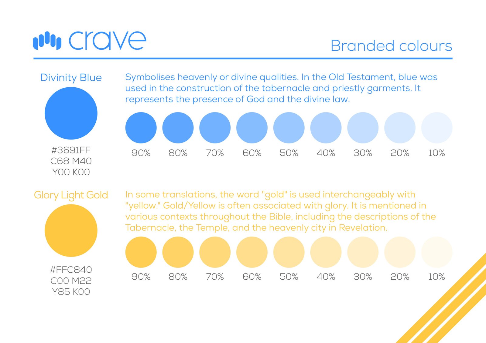
Colour Palette: The brand utilises two primary colours:
Divinity Blue (#3691FF): Symbolises heavenly or divine qualities and represents the presence of God and divine law.
Glory Light Gold (#FFC840): Associated with glory, drawing from various biblical contexts.
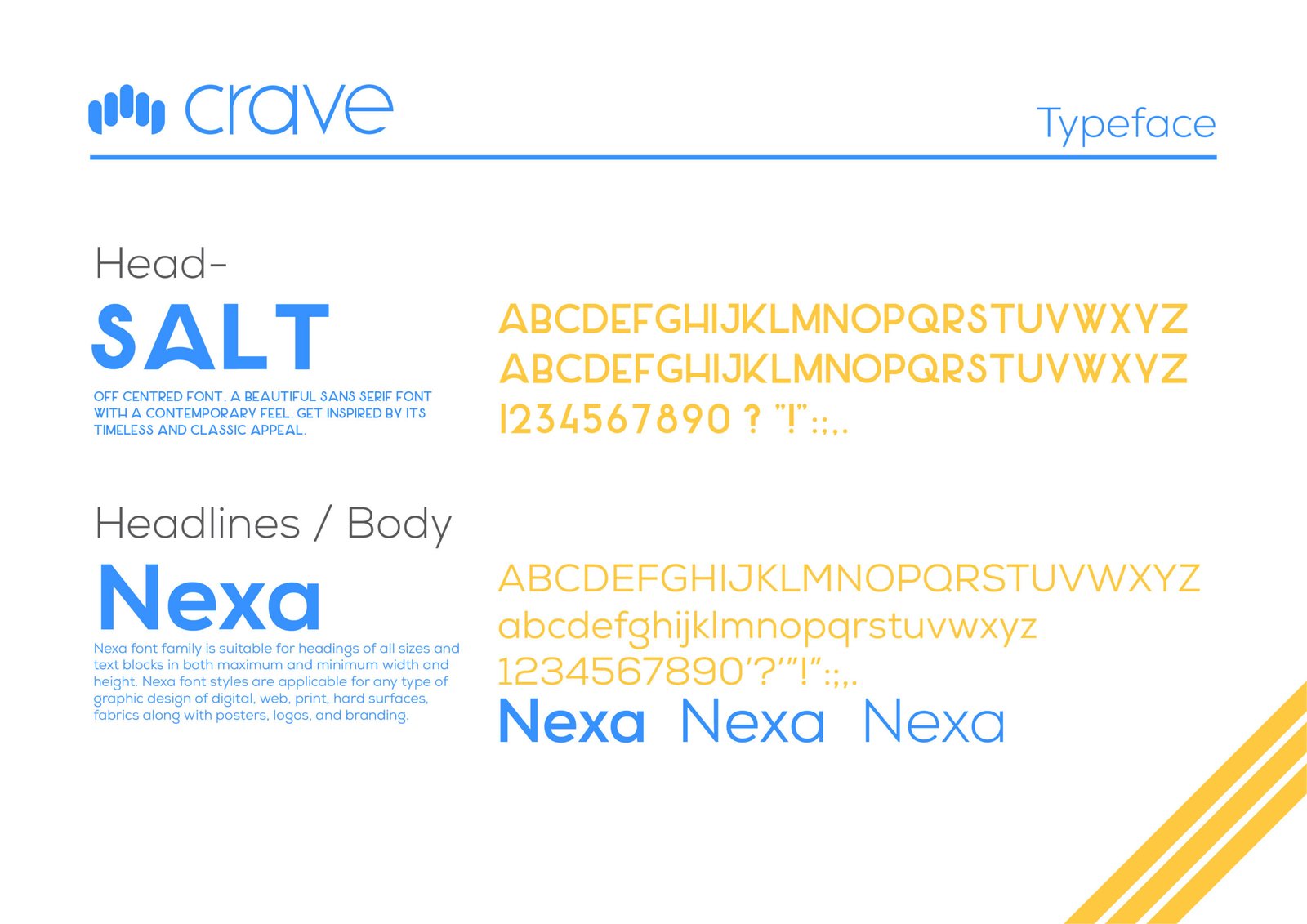
Typography: The brand employs two primary typefaces:
SALT: An off-centred, contemporary, and classic sans-serif font used for headlines.
Nexa: A versatile font family suitable for headings of all sizes and various text blocks, including digital, web, and print applications.
Design Application
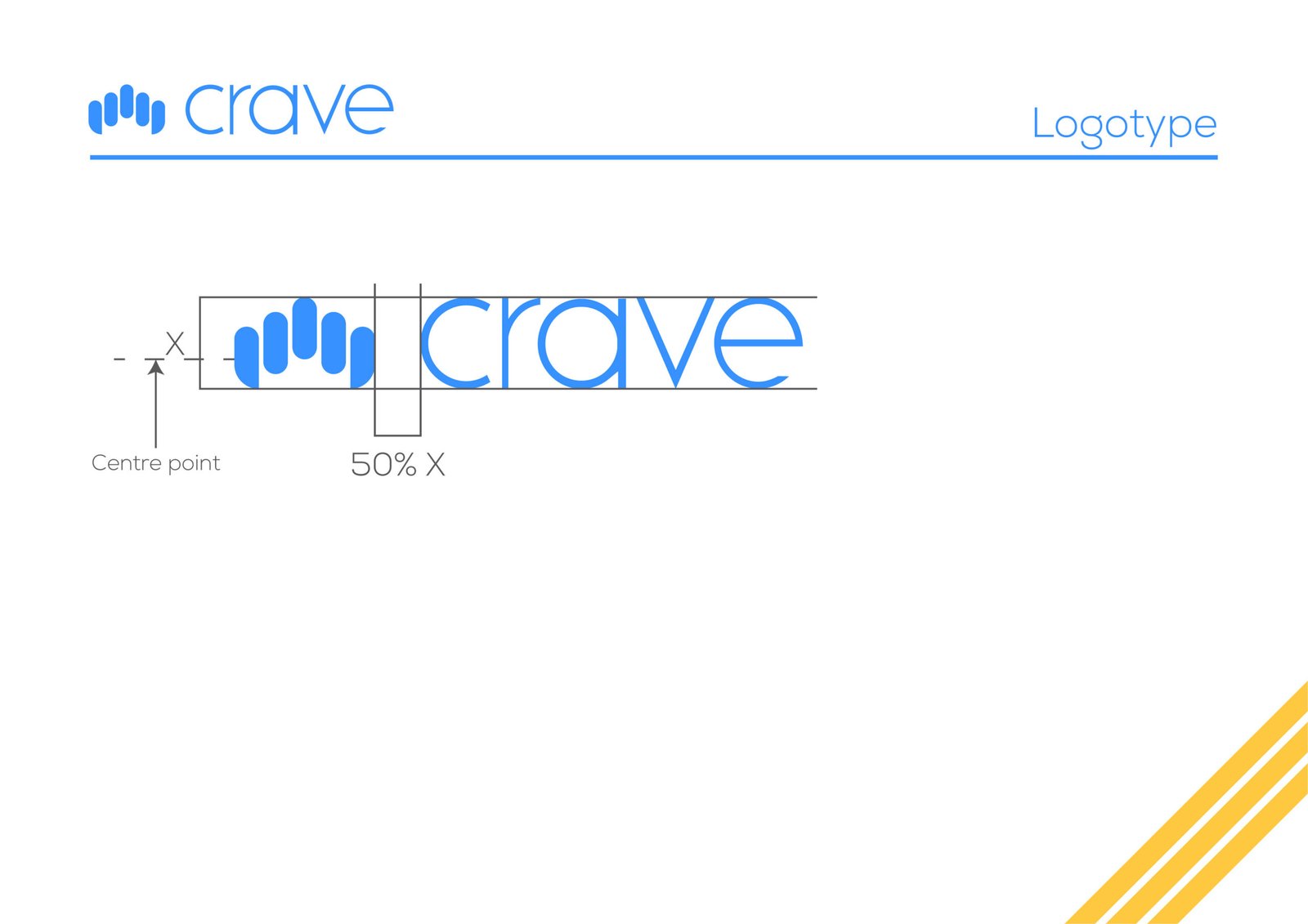
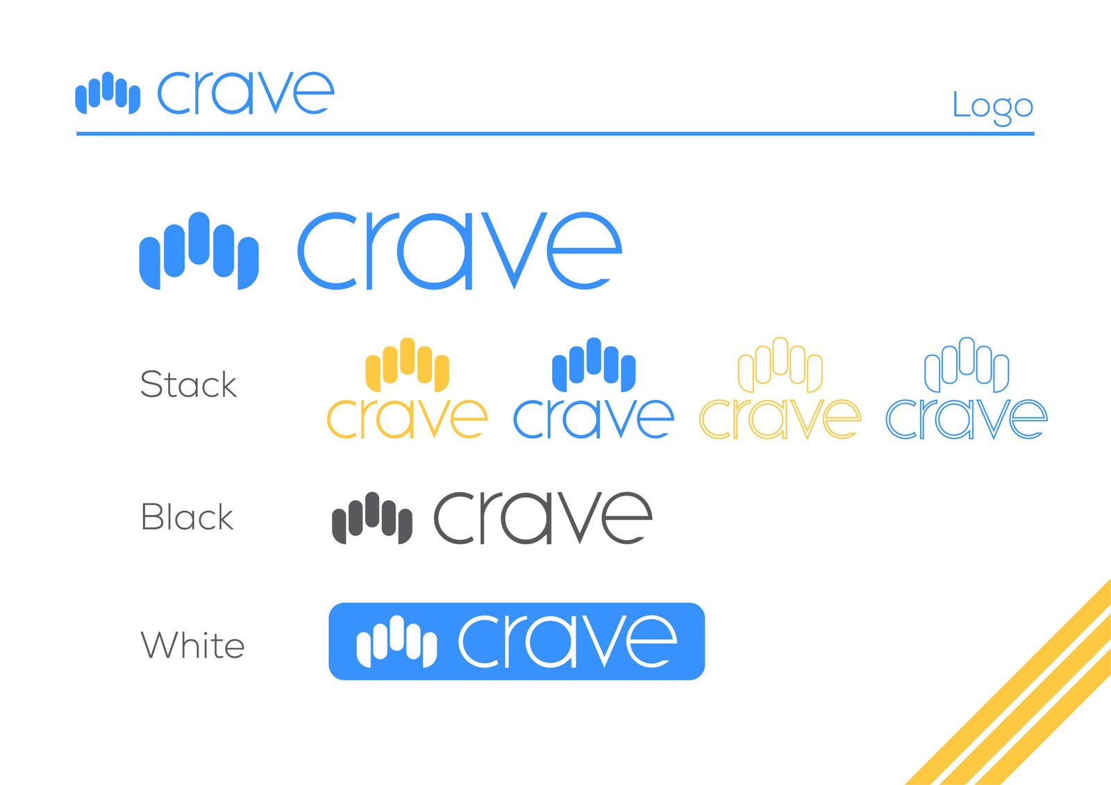
Logotype: The brand guidelines define specific structural and spacing requirements for the “crave” logotype and logo, including a designated center point for placement.
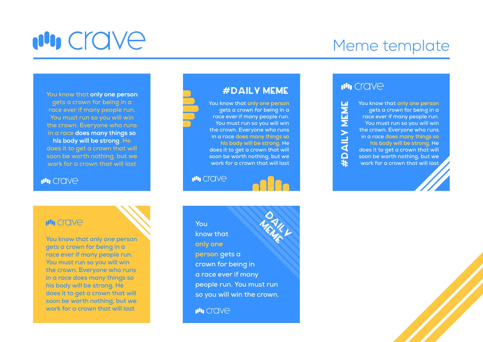
Social Media: Marketing materials, such as “#DAILY MEME” templates, apply the brand’s color palette and typography to create a cohesive, fresh, and bright aesthetic.