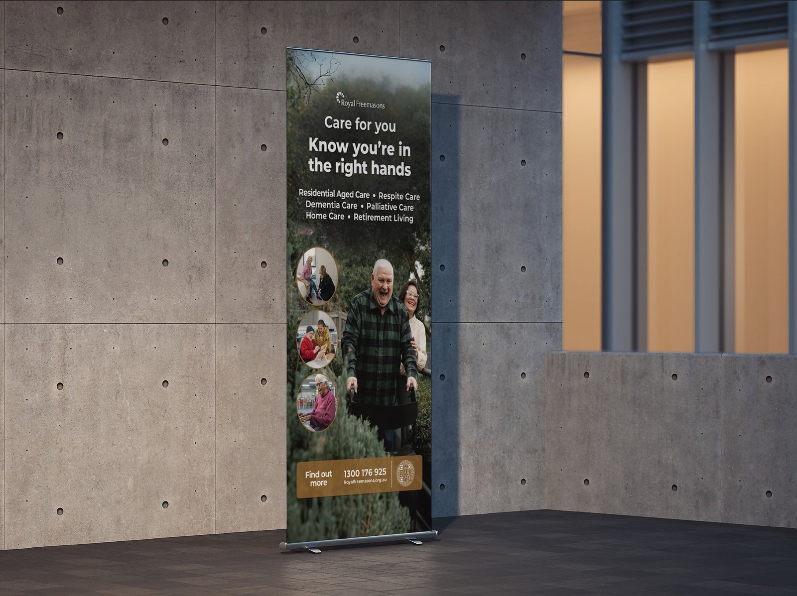
For this pull-up banner, the objective was to create a high-impact, professional communication tool that immediately conveys the comprehensive care offered by Royal Freemasons. The design needed to balance corporate trust with genuine warmth and approachability.
The layout utilizes a rich, dark background overlaid with a lifestyle image to establish a premium yet comforting atmosphere. Grounded in a minimalist philosophy, the typography is clean and hierarchical, allowing the core message—“Care for you. Know you’re in the right hands.”—to be instantly digestible.
By employing a refined, stacked layout, I ensured the list of six distinct service areas remains prominent and legible at a glance. To foster an immediate emotional connection with the audience, I integrated circular lifestyle insets on the left, breaking the verticality and showcasing the human stories behind the brand. This combination of strategic information design and empathetic imagery creates a cohesive, professional presence that reassures prospective residents and their families.