Everdalewellness, a practice focused on restoring health through natural and holistic approaches, such as nutrition, herbal support, and massage.
Brand Identity
Core Philosophy: The brand aims to be natural yet proven, and nurturing yet credible.
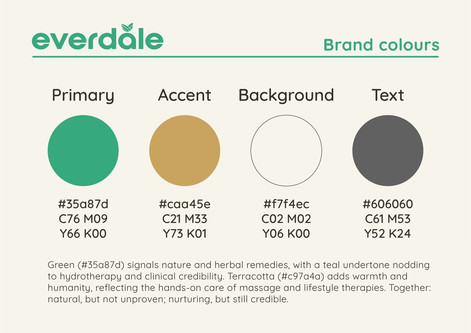
Color Palette: The palette utilizes a primary green (#35a87d) to signal nature and herbal remedies, with a teal undertone for clinical credibility. An accent terracotta (#caa45e) is incorporated to add warmth, humanity, and a connection to hands-on therapies. A neutral background (#f7f4ec) and text color (#606060) complete the visual system.
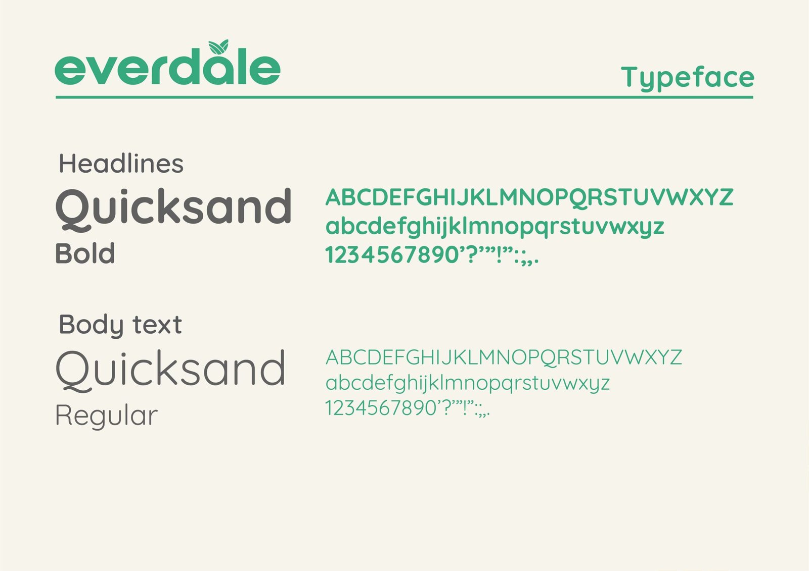
Typography: The brand uses Quicksand for both headlines (Bold) and body text (Regular) to maintain a clean, modern aesthetic.
Design Application
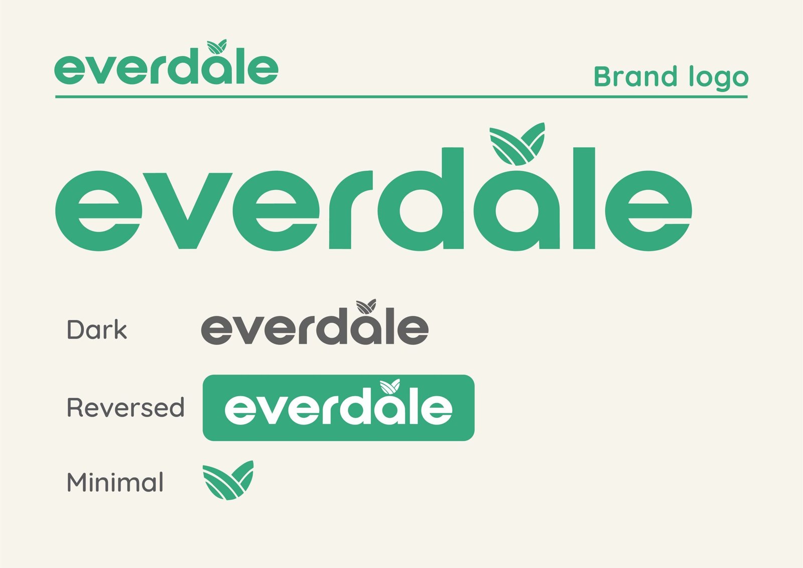
Logo & Visuals: The brand includes variations such as “Dark everdale,” “Reversed everdale,” and “Minimal”.
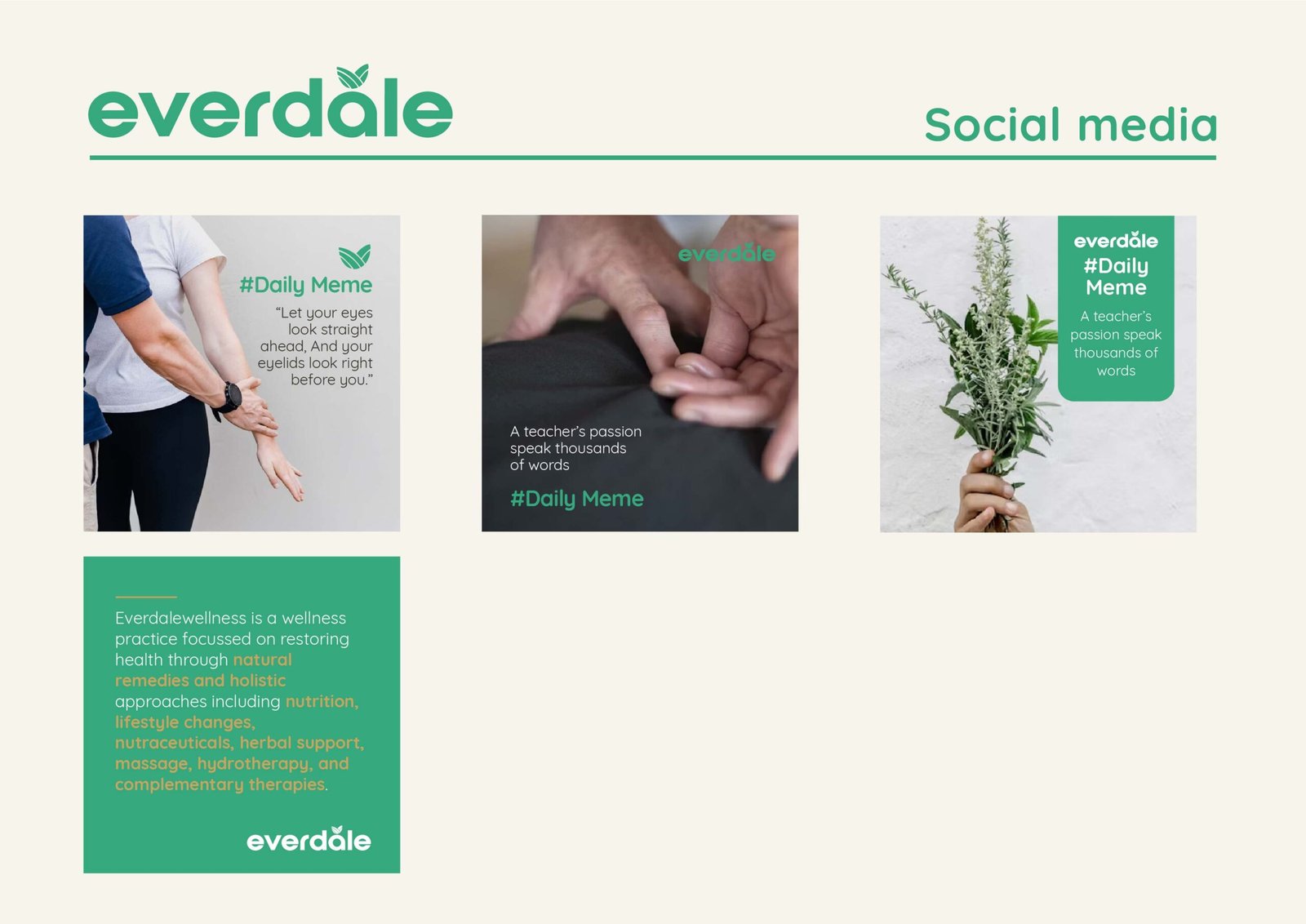
Social Media: Marketing collateral, such as “#Daily Meme” posts, integrates the brand’s color palette and typography over imagery related to therapy, nature, and hands-on care to maintain a cohesive and professional presence.